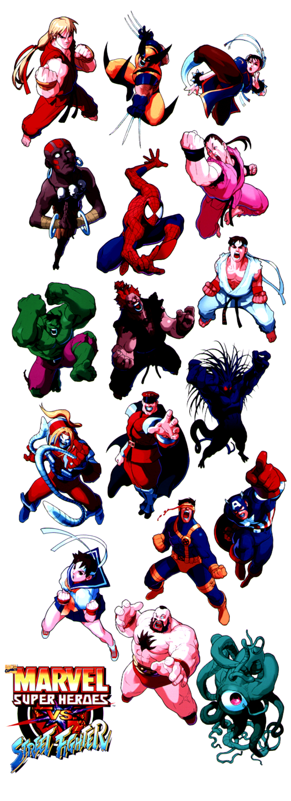
To kick off the artwork coverage on this site, I had no trouble in thinking of the most deserving set of game artwork. One of the best, most unique and brilliant sets of Capcom artwork comes from Capcom's line of VS games. Though the artwork of Street Fighter Alpha 3 Saikyo Dojo is arguably the best of Capcom's artwork, Marvel Super Heroes VS Street Fighter contains an amazing set of character illustrations. Better than the already great X-MEN VS Street Fighter illustrations, Capcom's Marvel Super Heroes VS Street Fighter artwork has a completely different style of presentation. One especially notable aspect of this set of Capcom illustrations is that it is the only one of its kind (for individual chaarcter art); the characters are, for the most part, all drawn from a 'looking-down' perspective. In all the Capcom artwork I have seen, other than a Super Street Fighter II promotional tournament poster, I have never seen Capcom artwork drawn in this style; for this reason, I find the art of MSHVSSF to be refreshing and at the same time completely of the quality only Capcom's creative staff can deliver.
The art of MSHVSSF screams of talent; just look at the beautiful texturing used in each of the characters. The texturing is similar to that of the art in XMVSSF, but in MSHVSSF there's an additional blue-tinted lighting effect used for the lower-region of the characters that enhances the feeling. The MSHVSSF illustrations are so great because in the way they were drawn, they fit the frantic tone of MSHVSSF's gameplay. Most of the characters are portrayed in a fit of rage (showing their pearly whites with pride) that completely conveys the attitude of the game; anyone who has played MSHVSSF, or even seen it knows what I am talking about. What are my favorites in this set? My favorite overall is Ken, because his illustration just looks absolutely fantastic; his aggressive personality emerges from the work. Wolverine looks great, Chun-Li could have never looked better, Spiderman looks cool, and Dan looks awesome. I think that one of the best in this set is Akuma - he looks exactly like the demonic ill-intented fighter we have come to know. Because of the perspective that the artist designed these illustrations in, characters like Omega Red, Shuma Gorath, and Dhalsim have a somewhat added inhuman effect (tentacles, etc.). When you look at these illustrations, you know this game is an over the top, all out brawl fest. Enjoy some of the best official artwork in the history of Capcom design.


